Aug 31
Interview with font designer Xavier Dupré
Posted by Benedikte Vanderweeën on 31/08/2010
A couple of months ago, i got an e-mail from Xavier Dupré asking if he could feature one of my works on his website to showcase the use of his FF Masala font
I'm a big fan of Xavier's fonts and asked him a few questions about font designing:
10 questions for Xavier Dupré:
Xavier, can you present yourself shortly?
I was born in France in 1977. I studied graphic design in Paris as well as calligraphy and typography at the Scriptorium de Toulouse with Bernard Arin and Rodolphe Giuglardo. Since 1999, I've worked as a type designer in a packaging design agency. I've also collaborated with Lasdislas Mandel (known for telephone directory typography) on Renaissance experimental writings. Since 2001 I've lived in South-East Asia and spent some times in Europe. I prefer work in full freedom, without any constraint. I created latin typefaces for foundries such as FontFont & Emigre and also khmer typefaces for NGOs in Cambodia.
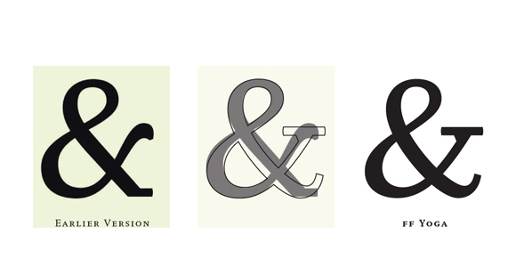
Initial & definitive design for Ampersand in FF Yoga
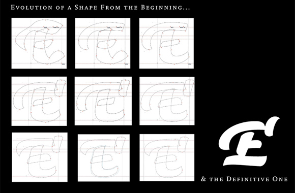
A few steps for 'swashed E' in FF Masala Script
How did you become a font designer?
When I was student in graphic design, I discovered type with my first macintosh by destroying fonts. Then I've been to the Scriptorium de Toulouse (South France) to learn calligraphy & typography. I then became to draw letters by hand.
What are you working on right now?
I'm working on 2 families: a contemporary slab (for 10 months already) and a garalde (for 1 month).
What is the name of your first font? Is naming a font difficult?
When I was a student, all my fonts got a name in -ix like Griffix, a kind of signature. Now I try to find a name in relation with my life and my travels avoiding english words (like most face names do). Foundries help me to find good names as well when my proposal is not a good idea. My first released face, FF Parango was previously named Parangon but it was not pronouncable for english-speakers.
Initial rough-font for FF Parango (1998)
Can you describe your work process? How does a font come to life?
Sometimes, I make some sketches in notebooks and this may help me to find shapes. Then, I draw directly on screen. The lower cases very quickly (a few hours) to see if it works. I redraw the shapes many times until I get satisfied. I continue with upper cases, figures. I begin the italics or other weights before finishing the first font. I often work on 2 different families and I take my time to mature the work. The work may be stopped 1 or 2 months to find fresh air and then I come back with a new eye.
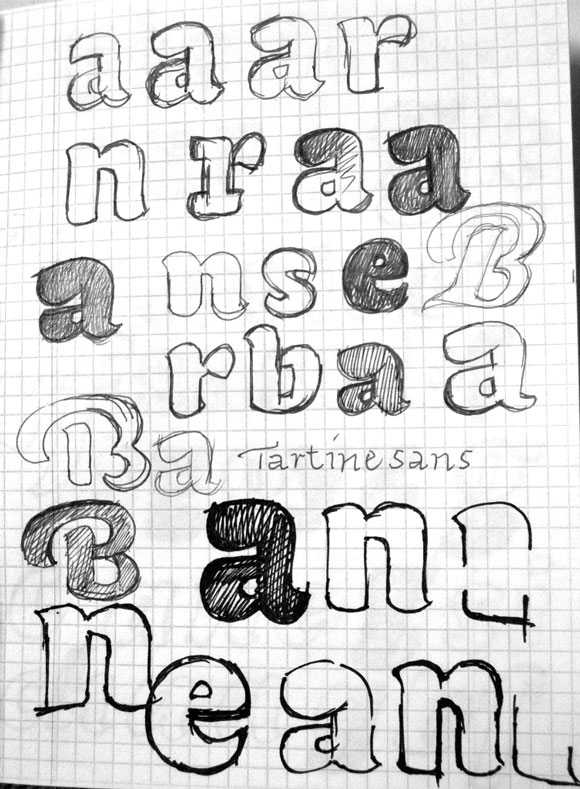
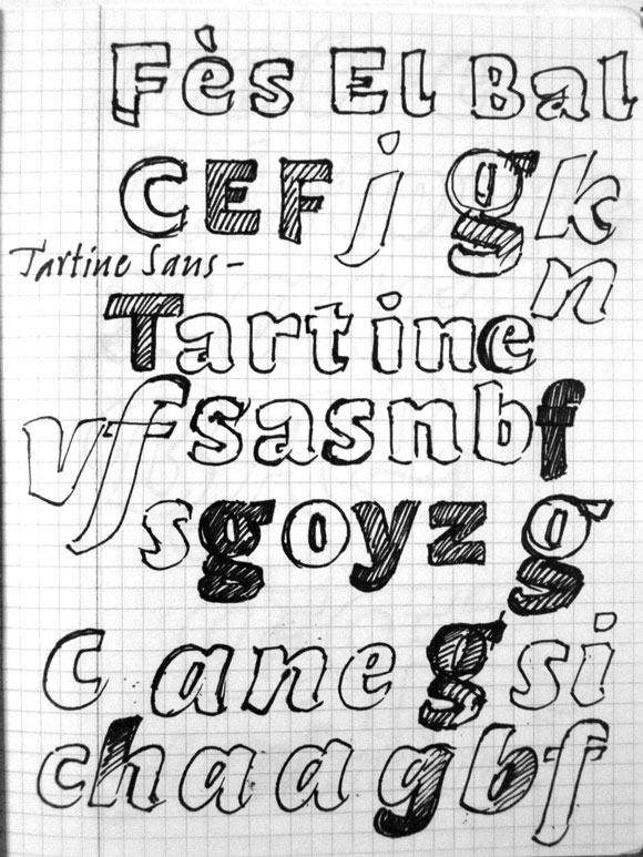
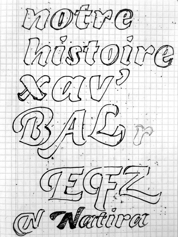
3 pages of the first sketches for FF Masala (initially a "Tartine Sans")
What is the time period between you designing a font and me buying that font online? Can you describe this process?
I often need 1 year before sending a submission to a foundry, then, I continue to work on the family with some foundry's directives. I send the final dates 6 or 8 months later and the fonts will be released less or more 6 months later. Most of the time, between the first sketches and the first royalties of the released fonts, we need at least 2 years and sometimes 3 years. With Emigre, the timetable is shorter.
As you know, font use on the web is evolving fast with services like Typekit where web-designers can subscribe to a plan and use quality fonts in their web-designs. Whatʼs your own opinion on font use on the web? How do you see this evolution?
We need new fonts for web design and the new web formats available in the last FontFonts is a very good opportunity to explore new visual fields on the web. Regarding TypeKit, I'm not sure this is a good thing for the font designers and foundries. But this is quite new and we still don't know how it will evolve.
Related to the previous question: what would be the ideal situation for a typedesigner and the evolution of the web?
I don't know exactly. But I consider the ideal situation would be that every user pay their licenses. Most users never pay any fonts and some graphic designers don't know they should pay to use fonts in their works!
You have a nice portfolio website which features work from others with your fonts in use. Did you spend a lot of time in researching how your fonts are being applied?
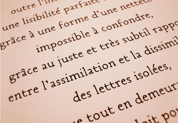
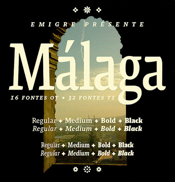
Some designers send me some links of fonts in use. With Emigre, I have a customers listing, so, I can easily find some works using my fonts. This is important to see its own fonts in use because if we don't see anything, the fonts doesn't exist and we have the impression to work for nothing. For the font users, this is interesting to see how works the font on a packaging, a magazine, etc. Some of font in use are very easy to find like FF Tartine Script which is everywhere in the french supermarkets but most of these uses are not very interesting to feature on my site. In the contrary, I know only a few uses for Malaga but most of them are beautiful & interesting.
Malaga in use
Do you have any tips for fellow font designers?
When some young type designers send me their work, I remark that most of them don't know anything about calligraphy. This is difficult to design faces without good notions of calligraphy. Besides, Calligraphy helps to draw curves with tensions and to see the black, the white between glyphes, the rythm also.
Thanks so much Xavier for this interview!
note: all images are copyrighted - Xavier Dupré 2010

Connect