May 18
using Typekit with Typetogether
Posted by Benedikte Vanderweeën on 18/05/2010
Last week, I signed up for a Typekit account, the web font-service with lots of great fonts. There is also a gallery available with examples on how you can implement typefaces in your webdesign.
I experimented a bit with the design from my previous post and tested a few fonts available from Typekit.
Typetogether
When i was browsing the Typekit catalog, i kept returning to the Bree font, this is a beautiful font by Typetogether.
Typetogether is a font foundry with a list of great fonts, fonts for the web which are available if you sign up with Typekit.

Take a look or order their printed catalog to get an impression on the quality fonts


Download the Ronnia font specimen pdf to watch some examples of the type in use.
Integrating Typekit in your design
Your own Kit Editor
After having registered with Typekit, you can launch your own Kit Editor. This editor is your panel to organize and control the fonts that you added while browsing the available fonts on Typekit. It comes with explanation on how to implement the javascript into your code in order to work on your website (your domain). The css selectors are also explained, so that you can easily implement the css code into your stylesheet.

Just check the weights and styles of the fonts you actually use in your website, otherwise, your typekit will be heavy and this will slow down your website loading time. In the right pane, an overview of the selected fonts can be seen with beneath a Publish button to publish the fonts to your site. Every time you change something, you have to click the publish button in order to see the changes.
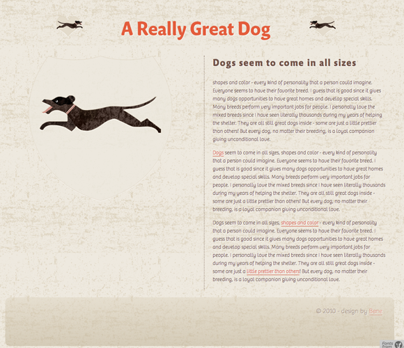
Personal choices
For my example, i chose the Bree font for the paragraphs, the FF Masala Web font from FontFont for the H2 and H1.
The CSS code
h1 {
	font-family: "ff-masala-web-1","ff-masala-web-2";
	font-weight: bold;
	font-size: 36pt;
	background: url(../images/header-bg.png) center top no-repeat;
	text-align: center;
	color: #e35c3b;
	padding-top: 20px ;
	text-shadow: 1px 1px 2px #fff;
}
h2 {
	font-family: "ff-masala-web-1","ff-masala-web-2";
	text-shadow: -1px 1px white;
	letter-spacing: 0.1em;
	color: #735449;
	padding-bottom: 10px;
	margin: 0;
}
p{
	text-shadow: 1px 1px white;
	line-height: 1.5em;
	font: 10pt/1.5em normal "bree-1","bree-2", sans-serif;
	color: #614238;
}
The reason why the font-family specification is split in two is to make them less usable as installable fonts, read more
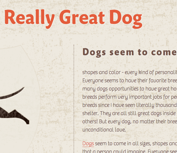
Zooming in
When increasing the type size in you browser, the quality of the fonts is still very good
View the live example with the font integration
Overall, i'm happy with Typekit, especially with the possibility to use some other fonts besides the regular web fonts that every web designer is using for so long now. I wish more font foundries would move in that same direction.

Connect