Oct 17
Making labels with CSS3
Posted by Benedikte Vanderweeën on 17/10/2010
I’m working on a redesign and am looking into the possibilities of CSS3. I made a Photoshop mockup for an “elsewhere on the internet” page in which i wanted to list social networks on a different way. So I made “flags” placed next to each other where each flag represents a “social network”.
Experimenting with CSS3
From Photoshop mockup to the browser
After I designed it in Photoshop - you can see the original idea on 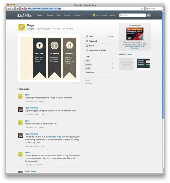 Dribbble, I asked myself how i could accomplish these labels using only code and css and no or less images. Read my insights and mistakes.
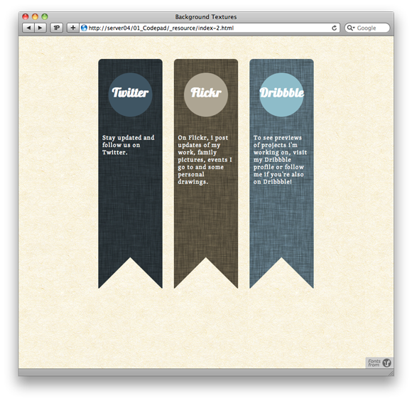
Before I start explaining, you can view the test page (by clicking on the image):
Tested browsers
Browsers that support CSS3 features
I tested on Opera(10.6), Chrome (6.0.4), Safari(5.0.2) and Mobile Safari (iPad and iPhone) and FireFox (3.6.6) on Mac OS X (10.6.4). I ignored Internet Explorer 8 because most of these CSS3 features are not supported.
Multiple backgrounds
Using textures
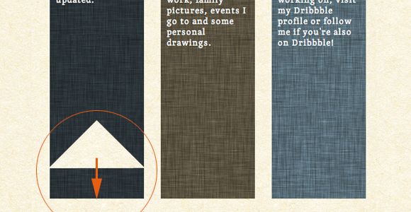
A great new CSS3 feature is Multiple Backgrounds". For a single HTML element, you can apply more than 1 background. That's what I did in the labels: i placed a tiled texture and above that I placed the triangle at the bottom so you have the impression of a "flag". Here is a screenshot of the triangle with transparent background place on top of the box:
The HTML for box 1:
	<section id="box-1" class="bordertop">
		<div class="circle1">
			<h1 class="one">Twitter</h1>
		</div>
		<p>Stay updated and follow us on Twitter.</p>
	</section>
The CSS for box 1:
	#box-1{
		float:left;
		background: url(../images/bg-triangle.png) no-repeat bottom center,url(../images/bg-box1.png) repeat;
		height:500px;
		width:140px;
		margin-right: 25px;
		}
The first background image is the triangle image that is not repeated and placed at the bottom at the center of the box. I gave the image the same width as the box width, 140px. The pattern image is the second image, named "bg-box1" and is repeated on the x and y axis.
Circles
Applying circles with CSS3
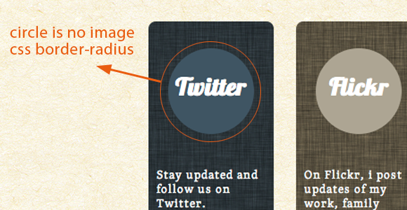
I wanted to have circles in the middle of the labels and looked for a way to accomplish this without using images. It is possible to do this with only css: assign the same height and width value to your class. Set the border-radius to half of the height and width value.
The HTML for circle 1:
	<div class="circle1">
		<h1 class="one">Twitter</h1>
	</div>
The CSS for circle 1:
	.circle1{
		background: #425563;
		width: 6em;
		height: 6em;
		border-radius: 3em;
		-moz-border-radius: 3em;
		-webkit-border-radius: 3em;
		margin:30px auto;
		}
To accomplish a circle, make sure the radius of the border is 50% of the width and height of the HTML element, here 6em and 3em.
Animation
Hover animation on the buttons
The names of the social networks in the circles will be used as the buttons. So, when hovering a button, a color change happens: the circle becomes white and the name becomes the initial background color. This is done with the transition property, you can see how i did it with the css:
The CSS for the hover:
	h1.one:hover{
		color:#425563;
		}

	.circle1:hover{
		background-color: rgb(255, 255, 255);
		color:#425563;
		-webkit-transition:all 700ms ease-in;
		-moz-transition:all 700ms ease-in;
		-o-transition:all 700ms ease-in;
		transition:all 700ms ease-in;
		}
the code for the hover effect is the same for the 2 remaining circles. The transition effect is used when hovering with the mouse over the circle (ease-in) and uses 700 milliseconds to fade to another background color and text color. Read more about transitions and animation in this Nettuts tutorial: CSS Fundamentals: CSS 3 Transitions and another great tutorial: Using CSS3 Transitions, Transforms and Animation
Styling text
Headings and body text
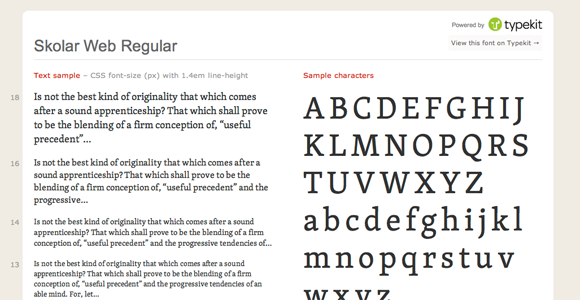
I used a H1 element for the titles in the circles, the body text was placed in a p-tag. For both elements, I looked for appropriate fonts. I used the Lobster font and Skolar from my Typekit account.
The CSS for the text:
	h1{
		font-family: "lobster-1","lobster-2","Helvetica Neue",Helvetica,sans-serif;
		color:#fff;
		font-size: 20pt;
		position: relative;
		padding: 1em 0;
		text-align: center;
		}

	p{
		font-family: "skolar-1","skolar-2";
		font-size: 10pt;
		letter-spacing: 0.1em;
		color:#fff;
		padding: 9px;
		}

Connect