Jan 04
Creating reusable buttons for your website.
Posted by Benedikte Vanderweeën on 04/01/2009
Let me start by wishing you all a very happy 2009!
We have been busy building websites and creating mock-ups for new websites.
I was looking for a way to make adjustable buttons for use in a website and tried to make a few reusable buttons in Illustrator after reading some tips in Computer Arts Magazine. Let me tell you how I made them:
Start by creating a style sheet for your client
I started by making a style sheet in Illustrator for each client's project. I don't mean a Cascading style sheet, but just a kind of file where you have all the colors for the project, the logo, the fonts and the other graphical user interface elements for the website. That's how I do it, maybe you have a another way for doing this. In this sheet, all graphic elements are accessible when constructing a button or another element.
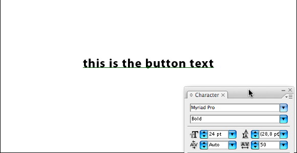
Type the button text
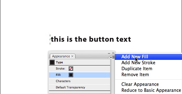
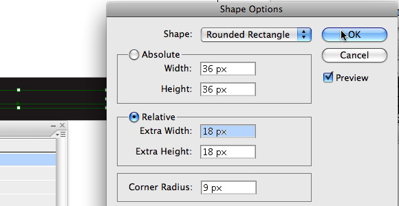
You can start by typing the button text. I used Myriad Pro regular for the font and a size of 24 pt. Select your text and choose from the menu Window > Appearance to bring this window in front. With the text selected, choose from the Appearance menu: New Fill. With the text still selected, choose again New Fill. From the menu choose: Effect > Convert To Shape > Rounded Rectangle. In the Shape Options window, choose Relative and fill in for Extra Width and Extra Height: 18px, corner Radius: 9 px. Click Preview and OK. Now we're going to replace the black fill with a gradient fill.
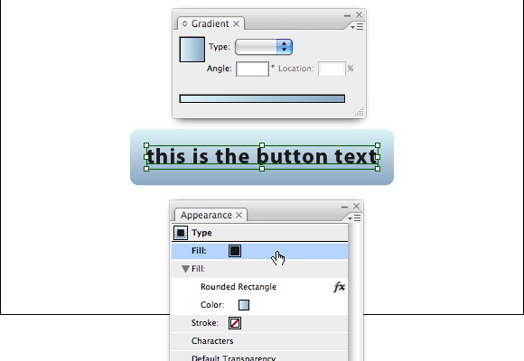
Define the gradient for your button
From the menu, choose: Window > Gradient. Choose a gradient, I used 2 tints of the same blue. In the Appearance palette, click the second fill (converted to rounded rectangle) to select it and click the gradient swatch in the gradient palette. Choose the lineair gradient and give a value of -90 degrees. You now have the text on top of the button.
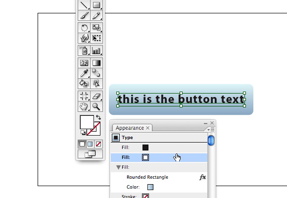
Give the button a glassy effect
To give the button a more glassy effect, we will need to make a few changes and adjustments. Select your button and choose from the Appearance Palette menu > New Fill. Drag this fill layer in the Appearance menu under the black fill on top and give this fill a white color.
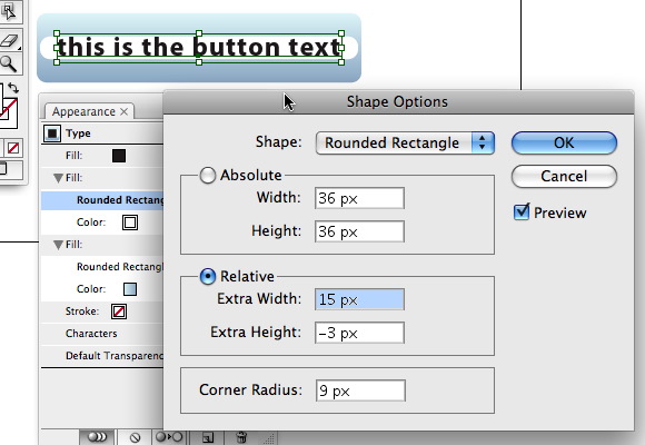
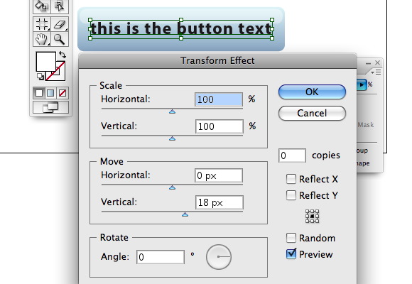
Select this fill if it isn't selected and go to the menu, choose again: Effect > Convert To Shape > Rounded Rectangle. In the Shape Options window, choose Relative and fill in for Extra Width: 15px and Extra Height: -3px, don't change the corner Radius (9 px). Click Preview to see if you're ok with the results and OK to close the window.
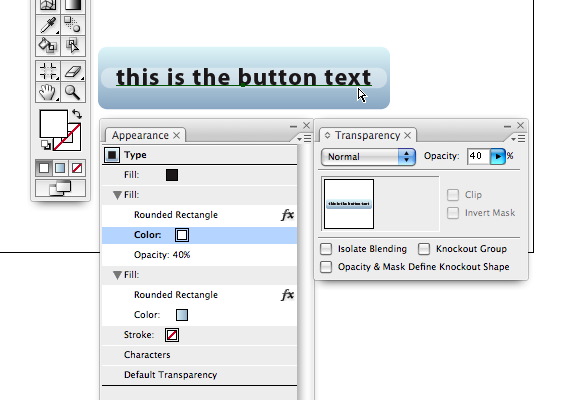
With the fill still selected, go to the menu, choose Window > Transparency and set the slider to 40%. Next choose Effect > Distort and Transform > Transform. Change the value of 0 to 18px by Move > Vertical. Make sure Preview is checked so that you can see the changes. Click Ok when you're done.
Giving a drop shadow and some text tweaking.
Your button is almost finished. We will give the text a stroke color.
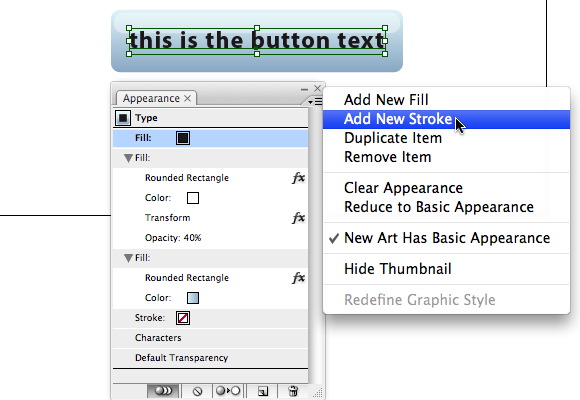
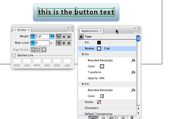
Select the top fill in the Appearance Palette and click the menu, choose New Stroke, give it a stroke of 2pt and a white fill. Drag the stroke layer under the black top fill in the Appearance Palette.
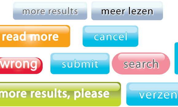
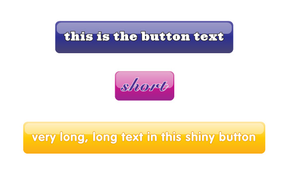
Et Voila! We're finished. You can now duplicate this button and adjust it to your needs, giving it other text, another font, other colors, etc..

Connect