Jun 05
Redesigning existing websites
Posted by Benedikte Vanderweeën on 05/06/2009
The last couple of weeks, I redesigned a few websites. This websites existed for a few years but needed a redesign. The fact that they were initially made in Flash came also into play. The website owners asked me to convert them into websites with a back-end that they can administer. For all of these website, I used ExpressionEngine as CMS.
Initial sketches and mockups
So, I started by doing some sketches and mock-ups. I used the 960 grid system template in Photoshop for the layout. I use this grid system for a long time now, and I find it a very useful and time saving system to rely on.
I want to show and explain the use of this grid system for the mock-ups and for the rapid layout you can achieve with this code and template system.
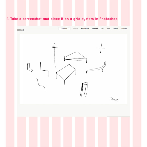
Starting with importing a screenshot
I started by taking a screenshot of the existing website (LittleSnapper is an excellent tool for this). Because this website existed already, I couldn't start from scratch. From within LittleSnapper, I opened the screenshot in Photoshop and pasted this screenshot into a new layer above the grid layer.
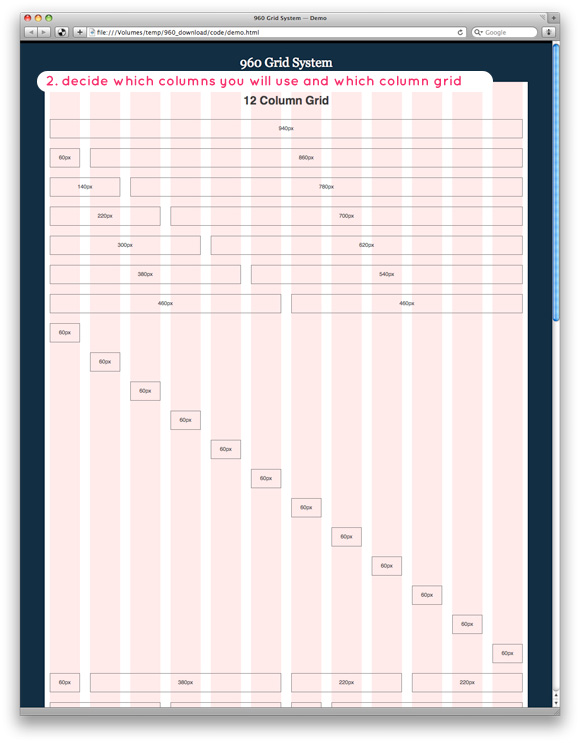
The grid framework
Once you have all the elements that you need in Photoshop, you start placing this elements in Photoshop on a grid. Decide which grid you gonna use, the 12 columns or the 16 columns grid. I used the 12 column grid by 960grid framework. This is common used and well-know css/grid framework. You can easily adjust each column in the mock-up.
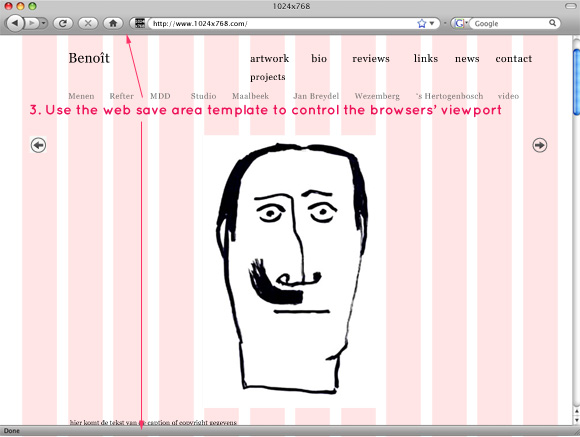
The browser viewport
The 960 grid is designed for a common viewport (web browser window) of 1024x768 pixels. A helpful tool for the web save areas (viewports) are the ready made templates at: http://www.designerstoolbox.com/. Download and open these templates in Photoshop and place them in a layer on top of your design.
Dissecting the CSS code from the template
So, when the design part is done, you will open your text editor to view the css and start converting the PSD (your Photoshop mockup) to CSS (Cascading Style Sheet) part. First, we make a new document, our index page where we code the mockup.
First, define how many rows your design has and what the corresponding CSS classes of the grid frame are.
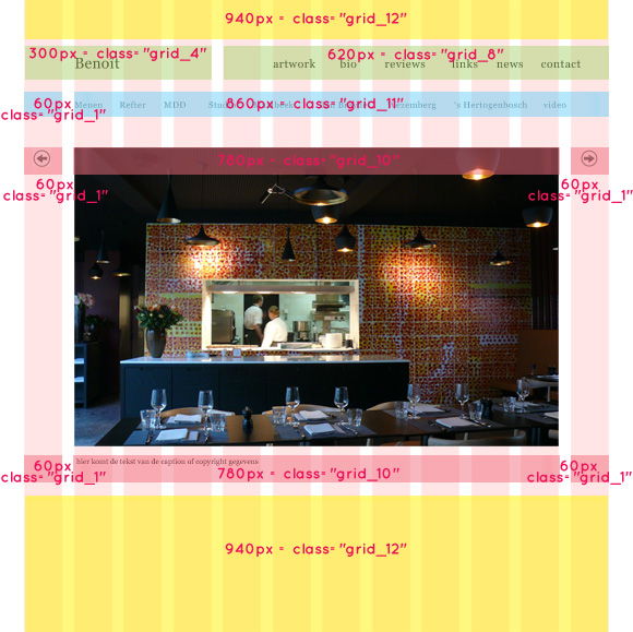
Once we designed the template, define the column widths and corresponding classes from the 960.css style template.
In your HTML document, make sure that all your columns are within the 12 columns container. In the head section of your document, link to the CSS files from the framework to make sure that all classes work.
<div class="container_12">
	<div class="grid_12">
		<p></p>
	</div>
	<!-- end .grid_12 -->
	<div class="clear"> </div>
	<div class="grid_4">
		<p></p>
	</div>
	<!-- end .grid_4 -->
	<div class="grid_8">
		<p></p>
	</div>
	<!-- end .grid_8 -->
	<div class="clear"> </div>

	<div class="grid_1">
		<p></p>
	</div>
	<!-- end .grid_1 -->
	<div class="grid_11">
		<p></p>
	</div>
	<!-- end .grid_11 -->

	<div class="clear"> </div>

	<div class="grid_1">
		<p></p>
	</div>
	<!-- end .grid_1 -->

	<div class="grid_10">
		<p></p>
	</div>

	<div class="grid_1">
		<p></p>
	</div>
	<!-- end .grid_1 -->

	<div class="clear"> </div>
	<div class="grid_1">
		<p></p>
	</div>
	<!-- end .grid_1 -->

	<div class="grid_10">
		<p></p>
	</div>

	<div class="grid_1">
		<p></p>
	</div>
	<!-- end .grid_1 -->


	<div class="grid_12">
		<p></p>
	</div>
	<!-- end .grid_12 -->
	<div class="clear"> </div>
</div>
<!-- end .container_12 -->
Starting with a template
Once you coded your template, you can begin by adding content or code to the corresponding column. With this template, you have the flexibility to adjust columns if the content doesn't fit the width of the column.

Connect