Dec 13
Drawing a (vector) christmas card
Posted by Benedikte Vanderweeën on 13/12/2010
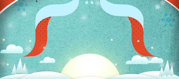
I started drawing a christmas card some weeks ago in my sketchbook. Some days later, I tried to make a vector based illustration from this sketch. I posted some parts of the christmas card on Dribbble and some people asked me to explain how I did this illustration
I'll explain some steps I took while drawing this illustration. I pick a detail from the whole illustration to explain in some steps
Starting with organizing your workspace
Setting up the Adobe® Illustrator® workspace
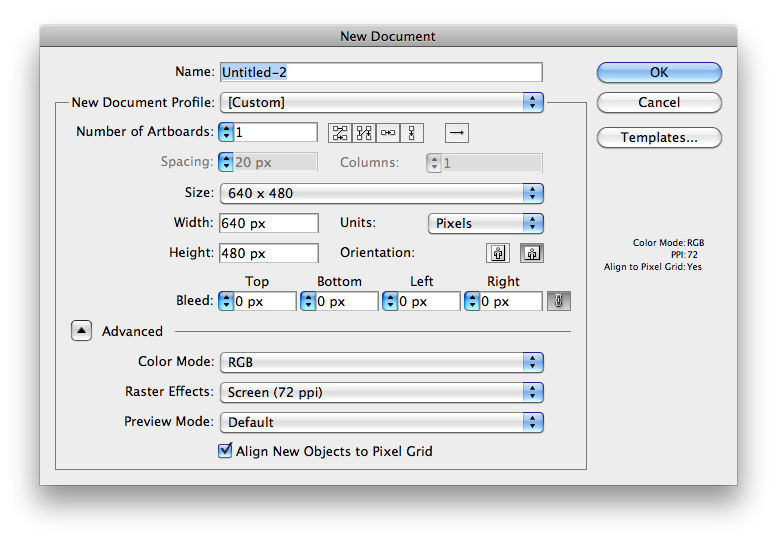
Make a new document with format 640 x 480px in RGB modus
I start with opening the layer panel which i use most often when illustrating: Window > Layers,Swatches, Gradient, Pathfinder, Align and Transparency
Next, I'll save this workspace setting by selecting the workspace name in the right upper corner of the Application Bar, choose Save workspace and type "illustration" and click OK. Next time you open a new document you can use this work space and the panel arrangements by selecting this workspace

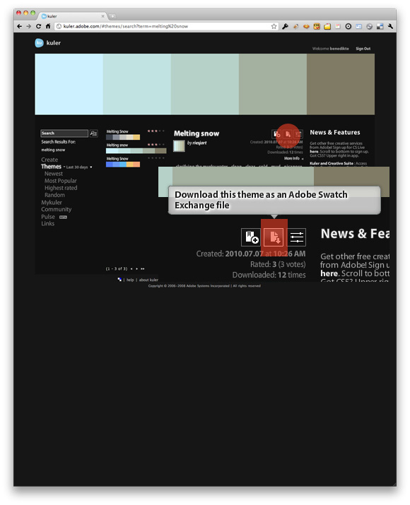
>Importing the color panel: i visit the Adobe® Kuler website often to choose my colors from. This time I searched on winter colors (keywords: snow, melting, ice, winter, etc..) and found this "Melting snow" color panel. You can download these swatches by clicking on the "Download this theme as an Adobe® Swatch Exchange file". This file is ready to be imported into Adobe® Illustrator.
I added an orange and a light yellow to the swatches and 2 more gradients.
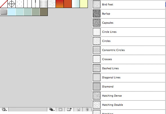
From the pattern menu, i choose some patterns that are part of the Illustrator install: Swatches > Open swatch library > Patterns > Basic Graphics_Dots and 2 more Basic Graphic_Lines and Basic Graphic_Textures
Make your layers and give them names: (from bottom to top) sketch, background texture, snow, landscape, text
Steps:
Setting up your sketch:
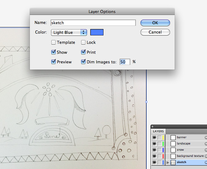
I start with placing the sketch into my Illustrator file. Placing the sketch on a separate layer in the bottom of the layers panel. This drawing indicates where you'll have to draw the right elements like trees, clouds and other parts of the drawing. Double click this layer and choose to dim the image to 50%. Next, lock it.
Drawing a rectangle to use as clipping mask
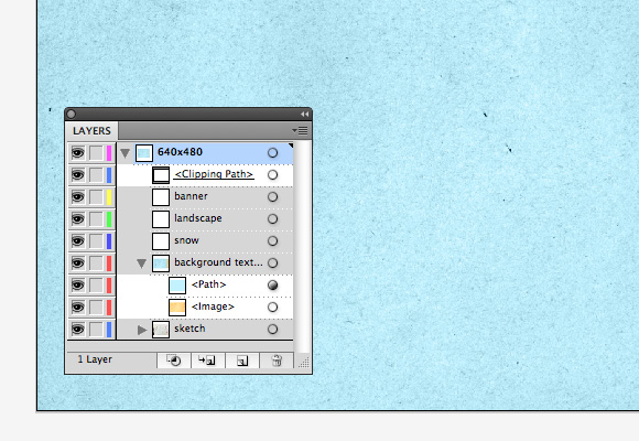
While you're working on your artwork, you'll make sure that every piece is within the boundaries of your file. You can do this by making a clipping mask on top of all your artwork. While you're working, you can toggle this mask on and off. Do this by adding a new layer and give it the name of 640x480. Next draw a rectangle of 640x480px on this layer with an empty stroke and fill. Next, make sure are other layers are placed within this new top layer. You can now toggle this layer on and off and use this as a clipping mask.
Drawing the sky and importing the texture:
Draw a rectangle the size of the file (640 x 480px), this will be the sky
Next, click File > Place and choose the paper texture (you can download the texture here). Draw another rectangle (640 x 480px) and give it a light blue fill. Change the opacity of this rectangle to Color.
The landscape
Next, hide (and lock) the background layer and make sure the landscape layer is selected.
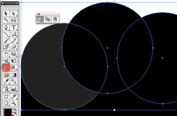
Start drawing the hills, the sun, the trees, the stars and the clouds. Use the Pen tool, the Ellipse tool in combination with the Pathfinder panel to combine and subtract forms: the hills: draw an circle and a rectangle and subtract the rectangle from the circle. The clouds: combine 3 or 4 circles with each other and subtract a rectangle at the bottom. Drawing the trees: draw a rectangle minus 1 anchor point and rotate this.
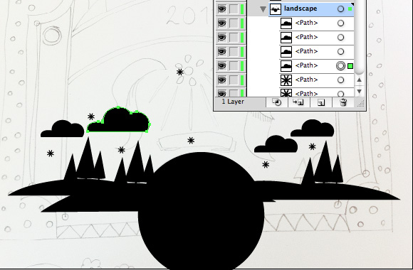
Some details: stars, trees, hills and clouds
The clouds: use the Shape builder tool (new in CS5, use pathfinder in previous versions) to combine/subtract forms:
The stars:
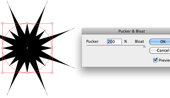
Drawing stars: draw a circle and choose Object > Path > Add anchor points. Next with the circle selected, choose Effect > Distort and Transform > Pucker and Bloat. Select 200 for bloat, select preview and click OK. Next, click Object > Expand appearance and choose Unite in the Pathfinder panel if you're Ok with the star shape. If you're not sure of the shape, you don't have to expand already, you can just wait and finish this shape when working on the overall illustration.
The trees:
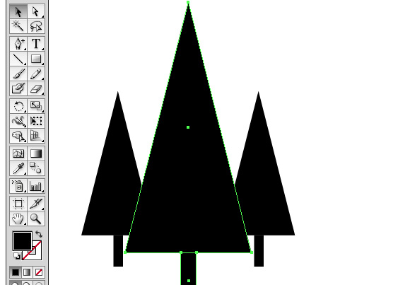
The trees can be done easily by drawing a rectangle, adding an anchor point in the center of the rectangle and deleting the 2 upper anchor points. Like this, you have a triangle. Add a smaller rectangle at the bottom of the tree and combine the 2 forms. Duplicate and scale the tree at the right and left side of the first big one.
Looking for a balanced composition
Once, you have all the different forms, you can start making a landscape composition: start with the hills and place the trees, add a sun in the center and duplicate some stars in the sky. Place the clouds in the sky. You can play with this shapes until you find a right composition. At the end, it should look something like this if you choose View > Outline.
Tip: just use 1 fill color for the elements in your composition, it will make it easier to have a balanced composition.

Coloring
Once every element is in place, start fill the elements with color. First, define your color panel with swatches, gradients and patterns and try them out in your elements.
The stars have some effects, select them fill them with the light yellow color, do the same with the winter sun and give them this effect: Effect > Stylize > Outer Glow. If you want to adjust the effect later, just open the Appearance panel and select the element you like to adjust, you will find the effect applied to it in the panel. Double click the effect and adjust it.
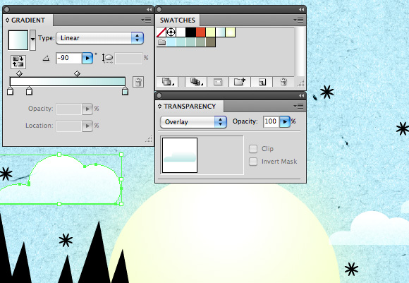
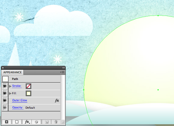
You will need to do some trial and error to find the right effect, it depends on your personal taste: some like effects others don't (or very minimal applied effects).
Placing the banner
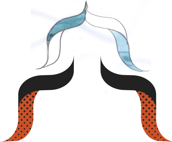
I sketched a banner and made a vector of it to use on top of the illustration to put some text and wishes on.
I applied a texture on it and placed it on top of the illustration:
Adding hand drawn text
I used a hand drawn sketch for the the title and did some further adjustments like adding a frame and some snowflakes.
You can keep it simple or you can further tweak the illustration.
So, i hope i explained it a bit more in detail, have a great Christmas xxx

Connect